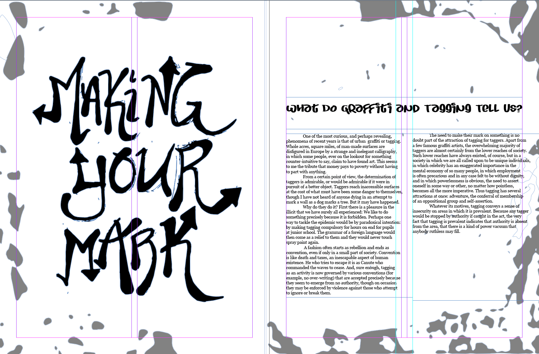
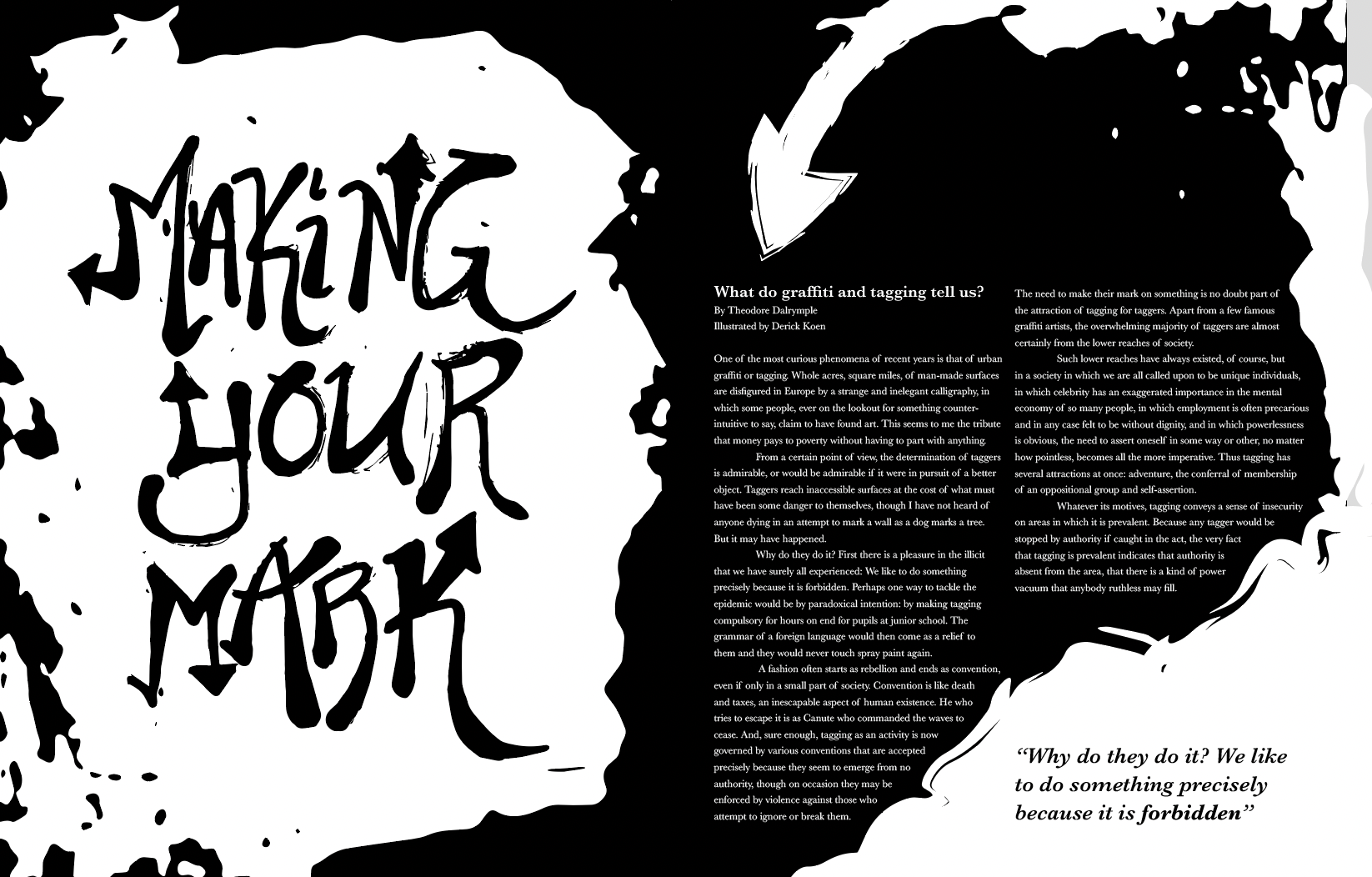
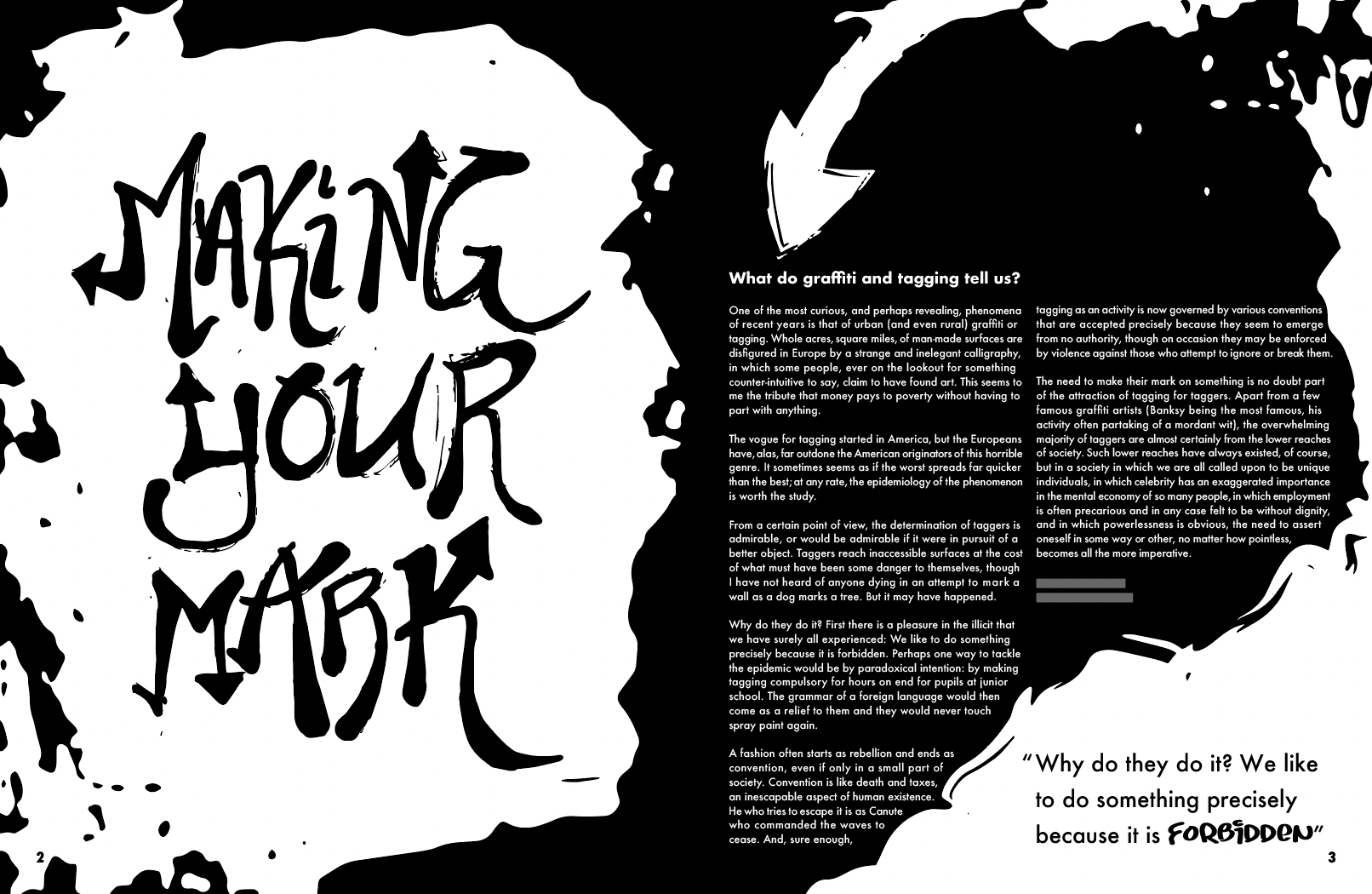
For this project, the goal was to create an artistic editorial spread for an article sampled from the website Psychology Today. I chose an article about why people chose to spray graffiti. There was also a focus on grid systems and typographic hierarchy throughout the body copy. All the letter on the left was hand drawn and digitally scanned into the work.

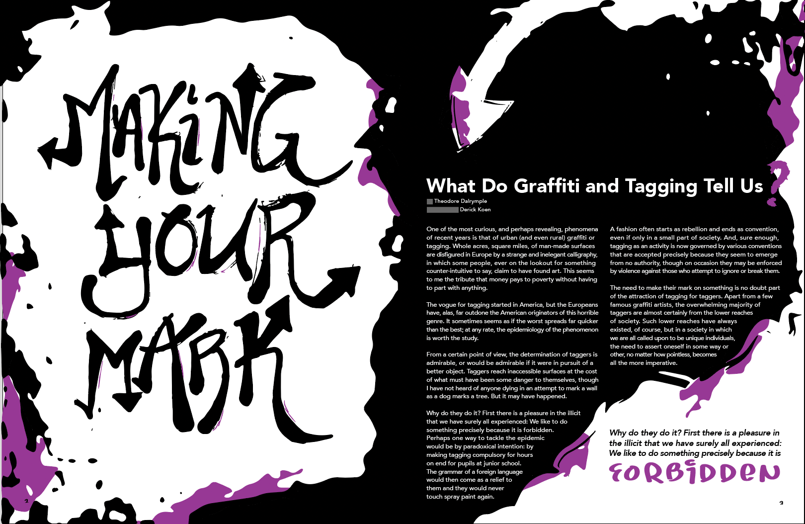
The final product, shown below, incorporates the header, title, byline, body text, and page numbers. The inspiration for color was a bold, contrasting purple to show graffitis use of splash vibrancy. This is my favorite project that I have worked on so far during my time at RIT.
